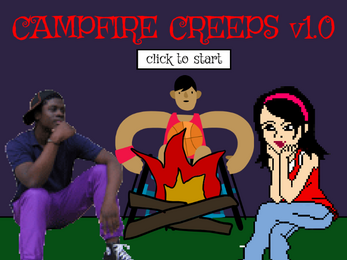
Campfire Creeps (v1.0)
created by gevillydev
character assets from scratch.mit.edu
made for the tales to thrill jam
made using scratch
UPDATE LOG
v1.0 (08/09/2024) - original build of the game
| Status | Released |
| Platforms | HTML5 |
| Author | gevillydev |
| Genre | Visual Novel |
| Made with | Scratch |
| Tags | campfire-stories, Horror, Short, storygame |

Comments
Log in with itch.io to leave a comment.
What drew me to this game:
General thoughts
story questions:
Overall
I liked the mixture of different textures. I also found this to be a unique take on the format of a visual novel. It’s format being it's number one selling piece. The typical format of a visual novel typically includes a large dialogue box at the bottom, with one character sprite to one side. This game presented the complete opposite of that format in a good way!
If the dev continues with visual novels, he should build on this format. I think it's a unique concept!
Why does the green flag mean play?
I made this with Scratch, that's just their start button and there's not a good way to convert the project to a functional/not buggy HTML file without retaining that
Is the UI supposed to be like a video player type of UI?
If you mean the menu options in the top left, again, just a byproduct of making stuff with Scratch. If you mean the game itself (like the text being timed instead of click-through), that was just a lot simpler to code because of the limitations with Scratch (if you're wondering why on earth I used Scratch, to put it bluntly, any more complex coding stresses me out and game development isn't a passion of mine anyways, I just like new ways to tell stories lol)
Was there a storyline?/Were the characters' stories related or connected?
Not really, no. It's a group of friends (if you want names, the one on the left is Trey, the one in the middle is Axel, and the one on the right is Ruby) around a campfire telling made-up stories to freak each other out, that's it. Very simple premise, was just the most clear-cut way to implement all of the themes for this jam, given my skill level, preferred game-style, and the time constraints.
On the other notes/constructive criticisms:
These are all really good notes and presented in a very respectful manner, which I appreciate. Whenever I have the time to make an updated build of this game, I'll definitely implement these (most of them, at least)
Thank you so much for all the notes and the kind words!